By Aleks Sheynkman
Director of Engineering
SpaceIQ
There are four types of wayfinding signs: identification, directional, informational, and regulatory. As standalone signs, they serve a specific role; as part of the greater wayfinding system, they inform each other.
Here’s what facility managers need to know about deploying each of the primary wayfinding types of signage.
1. Identification
Identification is the most common type of wayfinding signage. They tell a person when they have arrived at their destination. They also serve as general wayfinding landmarks.
Need to get your bearings? Identification signage is there for you. If you’re looking for Sales and you keep seeing signs for Human Resources, you know you’re in the wrong place.
Make identification signs uncluttered and straight to the point. What does the sign signify? Someone should understand it in seconds.
General examples
- Door plaques (Assistant to the Regional Manager)
- Departmental markers (Accounting and Finance; Sales)
- Landmark signage (donor plaque; historical marker)
2. Directional
Directional signage helps people get to where they’re going. It’s an invisible hand guiding them from wherever they are to their destination, one step at a time. They’re best used at junctions and areas without a clear traffic flow.
Anyone unfamiliar with their surroundings benefits from diverse directional signage. It can be as simple as a plaque at each junction sending people left or right. Or, it may be as comprehensive as colored lines on the floor leading people directly to their destination.
Continuity is key for directional signage. If a person becomes lost anywhere between two points using directional signage, it’s immediately invalidated. Picking up the trail again means backtracking or getting lucky.
General examples
- Junction signage (left to cafeteria; right to an exit)
- Colored lines on the floor (blue for marketing; red for sales)
- Directory signage (CEO, 8th floor; HR)
3. Informational
Whereas identification signage marks a particular area, informational signage pertains to the overall facilities. These signs give people broad information they need while navigating.
Informational signage is best placed in an area with broad exposure. Lobbies, waiting rooms, building entrances, and atriums are popular examples. Signage should answer questions before they’re asked. Where are your bathrooms? How late are you open? Do you have an elevator?
Informational signs should be universally understandable at a glance—signs and symbols anyone can understand.
General examples
- Amenities and accommodations (free Wi-Fi; elevators)
- Facilities signage (bathrooms; exits; cafeteria)
- Business information (hours of operation; address numbers)
4. Regulatory
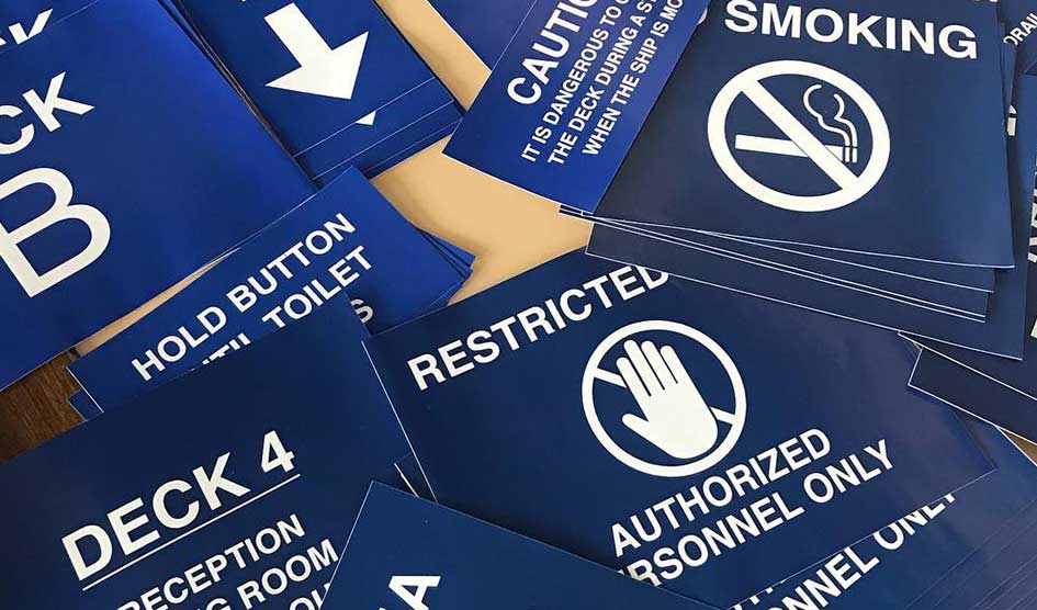
Regulatory signage is a proactive form of wayfinding. It’s focused on safety and liability concerns and sets boundaries—what is and isn’t acceptable in your facilities. It’s used to establish and reinforce rules, safety standards, and privacy expectations.
Regulatory signage is generally big and bold. No frills—only a clear, concise, prominent message. Someone probably won’t open a closet if there’s a “Caution! High Voltage!” sign on the door. Similarly, displaying a “No Pets Allowed” sign means Fido isn’t welcome.
Use regulatory signage wherever it applies and leave no room for ambiguity. A handicap sign sets a clear precedent, just like an “Employees Only” sign on a locked door.
General examples
- Rules and regulations (no smoking; no firearms)
- Compliance standards (ADA accessibility; high voltage sign)
- Access control (no entry beyond this point; employees only)
Combining wayfinding signage
Every type of wayfinding signage can and should be used with every other. Regulatory signs should keep people out of restricted areas as they follow directional signage to their destination. Identification signage should tell someone where they are, so they can follow directional signage to where they want to be. Informational signage—coupled with regulatory signage—needs to set behavior expectations in your facilities.
Additionally, all signage should be simple. Regardless of its purpose, someone should be able to look at a sign and known in seconds what it says, as well as what it means in relation to wayfinding.
Whatever the information, make sure you have the right mode of delivery. The simpler your signage and the more cohesive it is across all four types, the more effective it will be for anyone using it.
To view some of my signage projects, please go to my portfolio page.

